Skybox Security builds cybersecurity management software, which uses analytics to prioritize an organization’s risk exposures and recommend action to address those exposures.
Design Process
Following senior designer Ella Shamir’s research, I conducted multiple brainstorming sessions with the UX designer and the client, in order to crack the brief and the means for displaying the information.
Prior to the visual design stage, we created an interactive prototype that illustrates the concept. Following numerous attempts at simplifying the presented information, we came up with a clock-like visualization.
My
Role
UX-UI | year: 2016
I spearheaded the interface design process, from initial characterization, to concept and design cracking, to final design. I worked alongside the UX designer in interacting with the client and their development team.
The
Brief
We were asked to design a system that presents organizational cyberthreats and weaknesses on a visual map, enabling organizations to collect real-time data and protect themselves from attacks.
The challenge
The map had to display information from multiple sources located in different geographical regions of varying sizes; the interactions between these entities change constantly, and countless details are added and updated in real-time. We had to provide the ability to move around between entities, let users expand their research and present the risk level for each entity in order to display a comprehensive view.
Bottom line
The project requirement my full involvement from the UX design stage to finding a functional, elegant solution to the way data is displayed. Work was done in collaboration with the product manager and development teams.

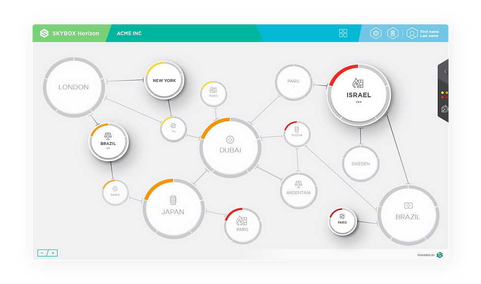
Each geographical region is grouped in its own circle, with the relevant risks presented on its perimeter. Each risk has its own dedicated place. The colors represent the threat level: red for severe, green for low. The lines show the network links between the entities. The size of the entity is demonstrated by the size of the circle – the more important the entity, the bolder it is. You can also drill-down into each entity and get comprehensive information concerning the cyber threat.
The display is light and clean. For each main screen component, the user can also open up a detail window with the information that contributes to a deeper investigation of risk. The user can also view every hierarchy down to the lowest level, and comprehensively explore the entities that make it up.